The Rainbow
Rolex Collection
360 CAMPAIGN
Creative Direction Art Direction Production Design
THE CLIENT
WatchBox, now The 1916 Company, is the largest retailer of preowned luxury wristwatches in the world. Target audience including collectors, high-net-worth individuals and enthusiasts.
ABOUT THE ASK
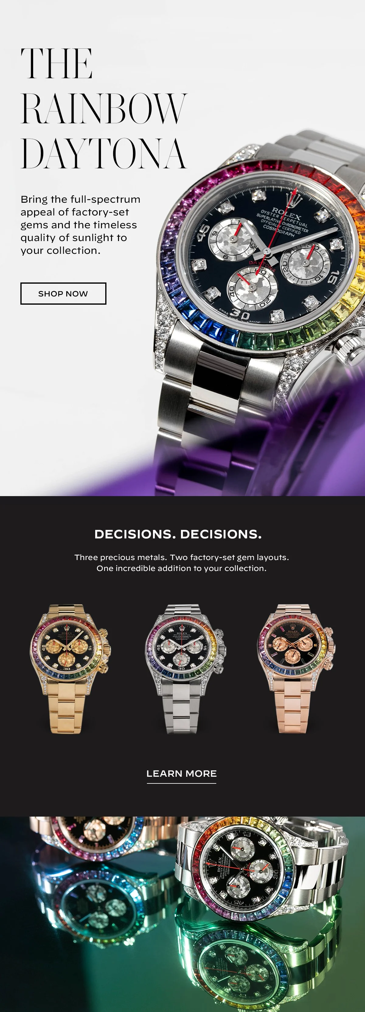
Concept, produce and disseminate a 360 Campaign aiming to showcase the breadth of Rolex inventory WatchBox has access to, in this case, featuring the rare Rainbow Rolex collection.

KATE’S TLDR
Rare as a Rainbow Rolex can be, it appeals to a very specific watch collector. Our goal was to educate our audience in the science of color and gem-setting; first discovering why it was made, then how, and finally translating that information into a campaign that informed and sparked interest.
DELIVERABLES
Homepage hero
Organic social
Paid ads
Email / SMS / Push
Custom landing page
Customer touch points

PHASE ONE
Discovery
and insights.
OBJECTIVES
Bring awareness to the depth of the WatchBox Rolex Collection
Educate the audience on why Rainbow Rolex matter
Generate new leads
Sell Rainbow Rolex models
Garner more brand recognition
Differentiate from competitors in art and tone
THE PATH
Identify and research the Rainbow Rolex’s differentiators
Use research to influence how we approach art direction
Solve for: How can we visually communicate why the audience should care about rainbow Rolex watches and talk about their unique selling points in different ways?
PHASE TWO
Strategies
and concepts.
IDEATION
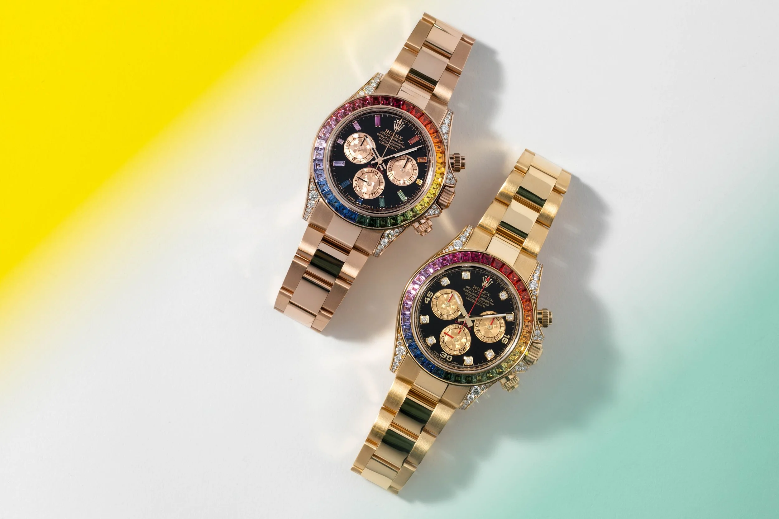
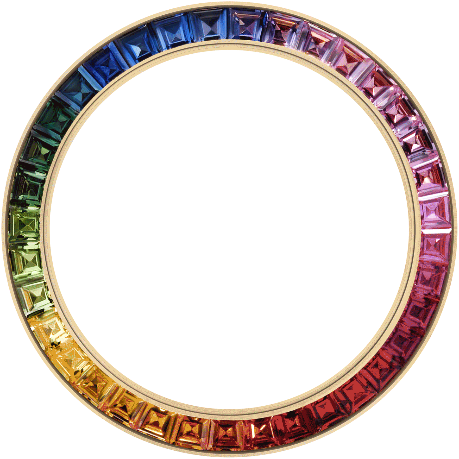
Throughout our research we found that the key differentiation and the element that makes these timepieces so precious, is the rainbow itself. Each gem making up each bezel of every rainbow Rolex ever produced, was hand-selected to match each hue desired exactly. Meaning, each gem takes a long time to find, and even longer to cut and color match. There was something to this art of color we could hang our creative hat on.
SOLVE
Explore the concept of color visually through materials of varying transparency
Make the topic our talking point as a global company for the length if the campaign
Utilize in-house experts discussing the topic in live shows
Create a custom landing page to test with audiences against standard product landing pages

PHASE THREE
Video, photo, copy,
and design production.
PLANNING
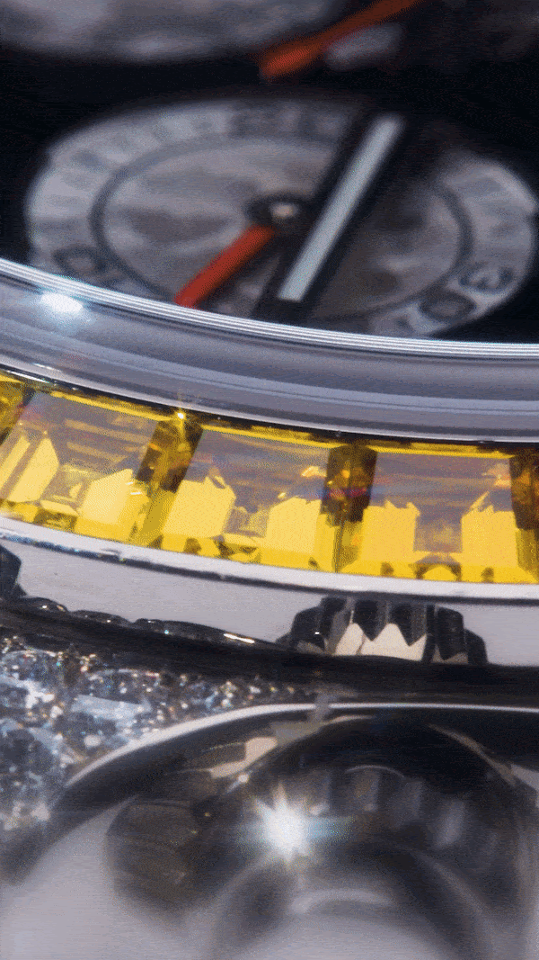
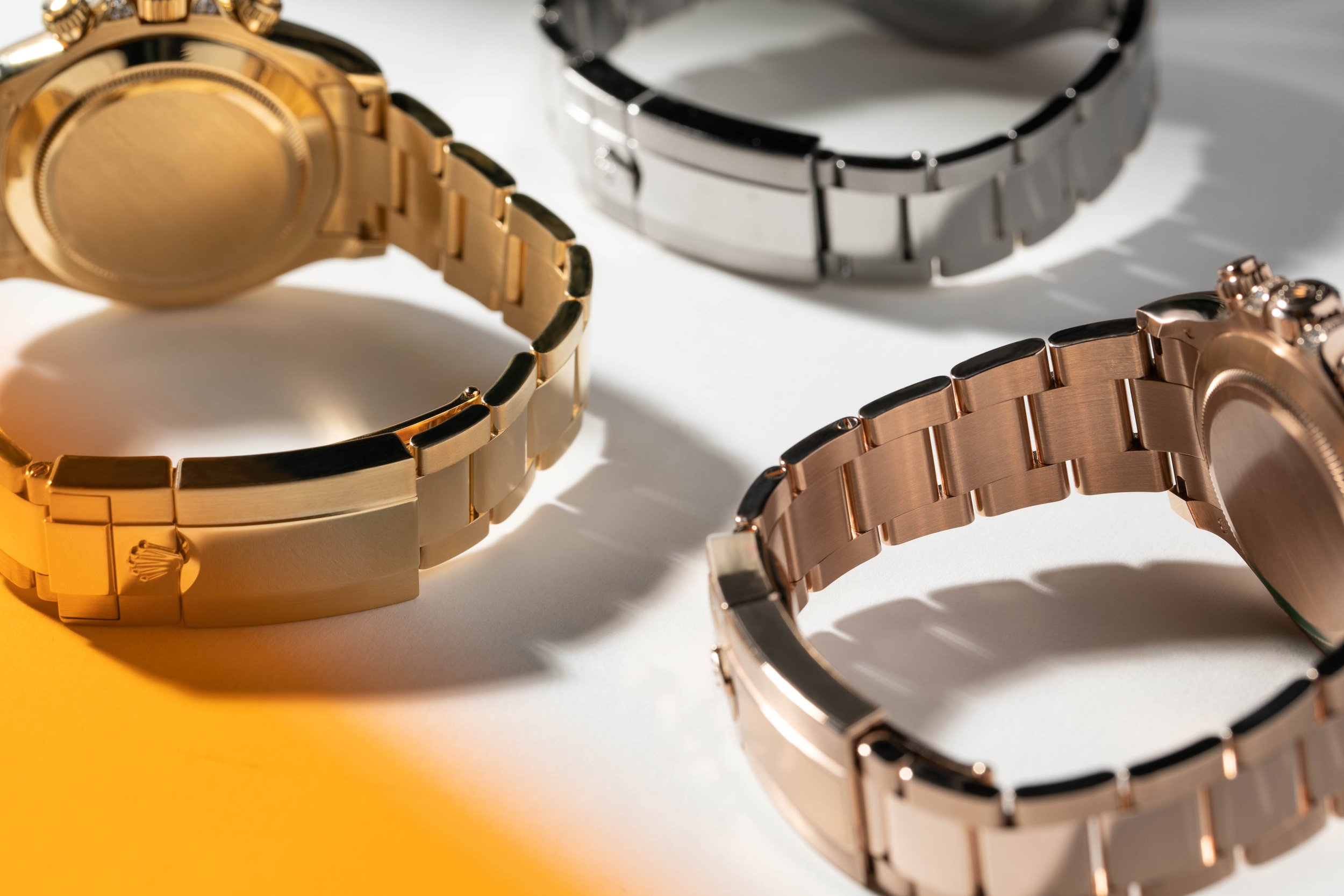
In-studio film and photo approach to reduce the need for transporting timepieces. Propping required research and field trips to procure material that would amplify the use of color without taking it too heavy-handed.
EXECUTING
During our time pulling swipe, the team decided to play into the playful nature of the timepiece as a whole. We experimented with several materials until ultimately landing on using a star filter to exaggerate how the gems catch the light, and colorful acrylics allowing us to play with color at various focal lengths of the composition.
OUTCOME
How it performed and what we learned.
TAKEAWAYS
Increased site traffic
Custom landing page won A/B testing over standard product landing page
Rainbow Rolex became part of the conversation across platforms, increasing our engagement and garnering excitement
RESULTS
Learning how to communicate with bold color, without overshadowing product or messaging
Educational entertainment wins in the watch community
Don’t be afraid to communicate the most obvious differentiator, but make sure you’re saying something different
Have fun with test shooting