Rebranding Friendbuy
BRANDING
Creative Direction Production
Brand Strategy Voice
THE CLIENT
Friendbuy is one of the leading marketing referral and loyalty technologies for enterprise businesses. Their software and expertise act as a roadmap for digital marketers to increase customer lifetime value and repeat purchasing.
ABOUT THE ASK
Bring Friendbuy into the new year with an updated brand more inline with its competitive landscape and more representative of its exponential growth.

KATE’S TLDR
Having the opportunity to work with Friendbuy prior to rebranding gave us more insight into how the brand was being used and identify creative needs as they continued to grow. Designing with their existing brand was limiting, and getting to know all of its applications proved case enough to craft a brand with a unique voice and strong graphic system.
DELIVERABLES
Brand Strategy
Brand Voice
Positioning Statement and Tagline
Logo and Wordmark
Graphic System
Typography
Color
Photography
Brand Guidelines
Brand Rollout

PHASE ONE
Discovery
and insight.
OBJECTIVES
Set Friendbuy apart from competitors
Branding that reflects what Friendbuy is now
Craft a brand that can grow with the company
Define Friendbuy as the authority in the loyalty and referral

THE PATH
Discuss likes, dislikes, wants and needs with client
Conduct a complete creative audit
Compile a competitive matrix for voice
Compile a competitive matrix for art
Solve for: In what ways can Friendbuy’s branding differentiate from competitors? What would be the best way to communicate their enterprising nature and roster of in-house experts?


PHASE TWO
Strategy
and concept.


IDEATION
With competitive analysis, we found similar language being used across the mar-tech industry. Along the lines of, revolutionary, high-tech, flexible and the like. Across a matrix we deduced Friendbuy’s strongest brand differentiator was the power of their team, comprised mostly of marketers themselves. This enables Friendbuy to predict pain points and better relate to customers.
Design and art direction concentrated on translating concepts that could communicate to the enterprising nature of Friendbuy, high-tech themselves and highly iterative based on customer feedback.
SOLVE
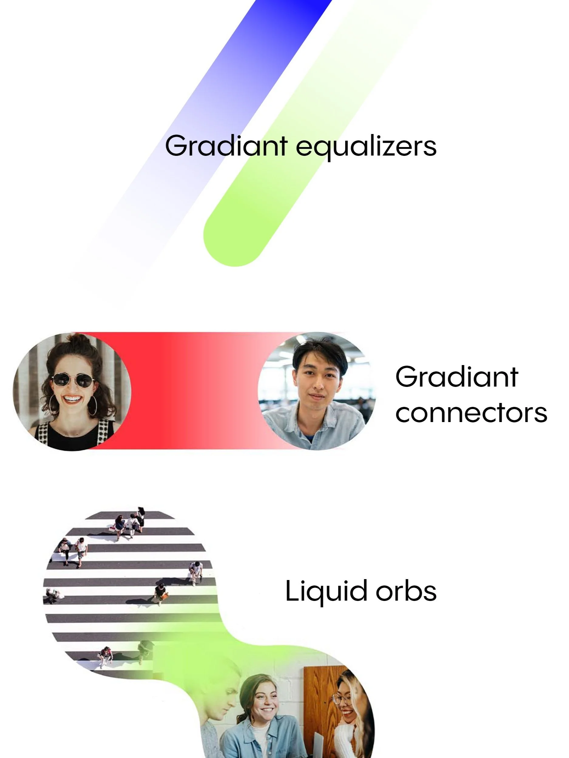
Our path forward landed on bright, bold and tech-forward palettes with a broad graphic system of what we named, gradient equalizers, connectors and liquid orbs, giving us the ability to illustrate motion and human connection.
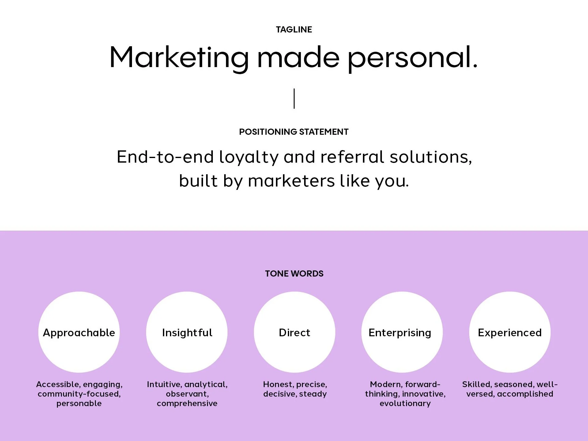
Brand voice took on an approachable persona with a pulse on what digital marketers are thinking and feeling.
Tagline: Marketing made personal.
Positioning Statement: End-to-end loyalty and referral solutions, built by marketers like you.

OUTCOME
How it functions
and what we learned.
TAKEAWAYS
Once direction was honed, we formulated a rollout plan befitting Friendbuy’s needs. Materials would transition over time, culminating in the release of their new site design (launching Fall 2024). Working within the guardrails of the new brand over a slow transition allowed us the ability to predict issues for brand use cases in both voice and visual elements—speeding up final output and handing off toolkits and templates to grow with the brand.
PUT IN PRACTICE
The importance of graphic elements that can flex in the mar-tech industry
Account for future states of the brand
Working within existing branding during discovery can help us identify pain points and future needs
How to bridge the B2B gap between product and professional

